Preface
Bubbly Bartending is a mobile bartending service specializing in upscale private events, weddings, and curated beverage experiences. I originally designed the company’s first logo while I was still in college. Years later, after the business had grown and expanded its clientele, I was brought back to redesign and elevate the brand identity.
This project represents both creative growth and long-term brand stewardship.
Phase 1 - Brand Identity (College Work)
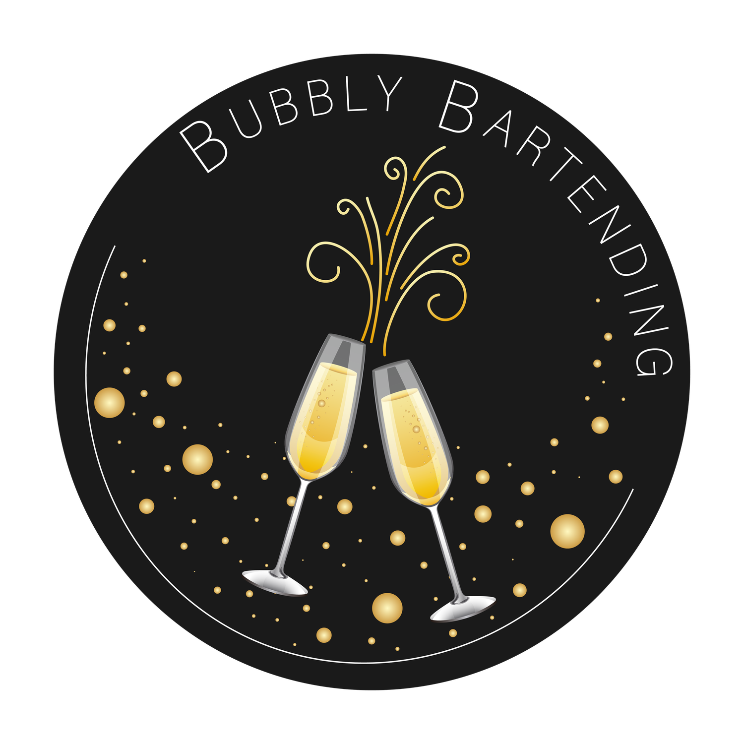
The original logo (created in 2020) established the core visual concept: celebration through champagne.
The design featured:
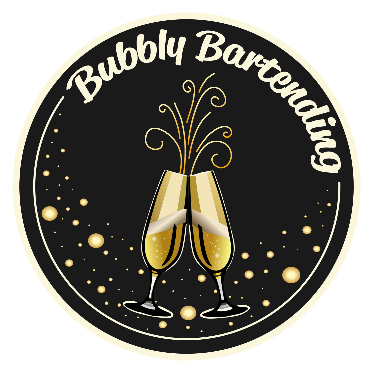
- Two champagne flutes clinking
- Gold bubble elements to communicate effervescence
- A circular badge format for versatility
- A black and gold palette to suggest luxury and evening events
The goal at the time was to create something celebratory, legible, and usable across coasters, signage, and social media.
It successfully gave the company a recognizable identity during its early growth phase.
Phase 2 - Brand Redesign & Elevation
As the business matured, the brand needed refinement. The redesign focused on increasing elegance, cohesion, and scalability. This project was completed in 2024.
The goals of the redesign were:
- Refine typography to feel more premium and less rigid
- Simplify and stylize the champagne illustration
- Improve balance within the circular composition
- Increase flexibility for merchandise and event collateral
- Maintain brand recognition while elevating sophistication
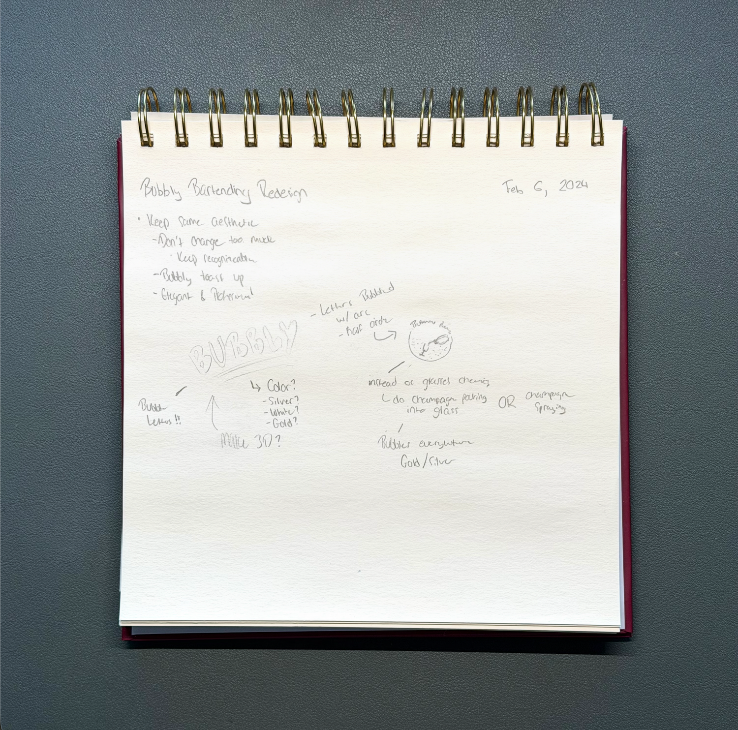
Sketches were developed exploring:
- Lettering adjustments
- Gold versus silver detailing
- Glass angles and symmetry
- Bubble density and distribution
- Line weight consistency
This process ensured the redesign felt intentional, not drastic.
Key Design Improvements
Typography shifted from a thin, spaced-out sans serif to a more fluid, celebratory script.
This gave the logo warmth and personality while better matching the event-driven industry.
The champagne glasses were refined with stronger silhouette definition and simplified highlights, making them more scalable for embroidery, stickers, and print materials.
The outer border treatment was softened to feel more premium and less harsh. Bubble placement was adjusted to create visual rhythm rather than randomness.
Gold tones were deepened and unified to reinforce the luxury positioning of the brand.
Application and Real-World Impact
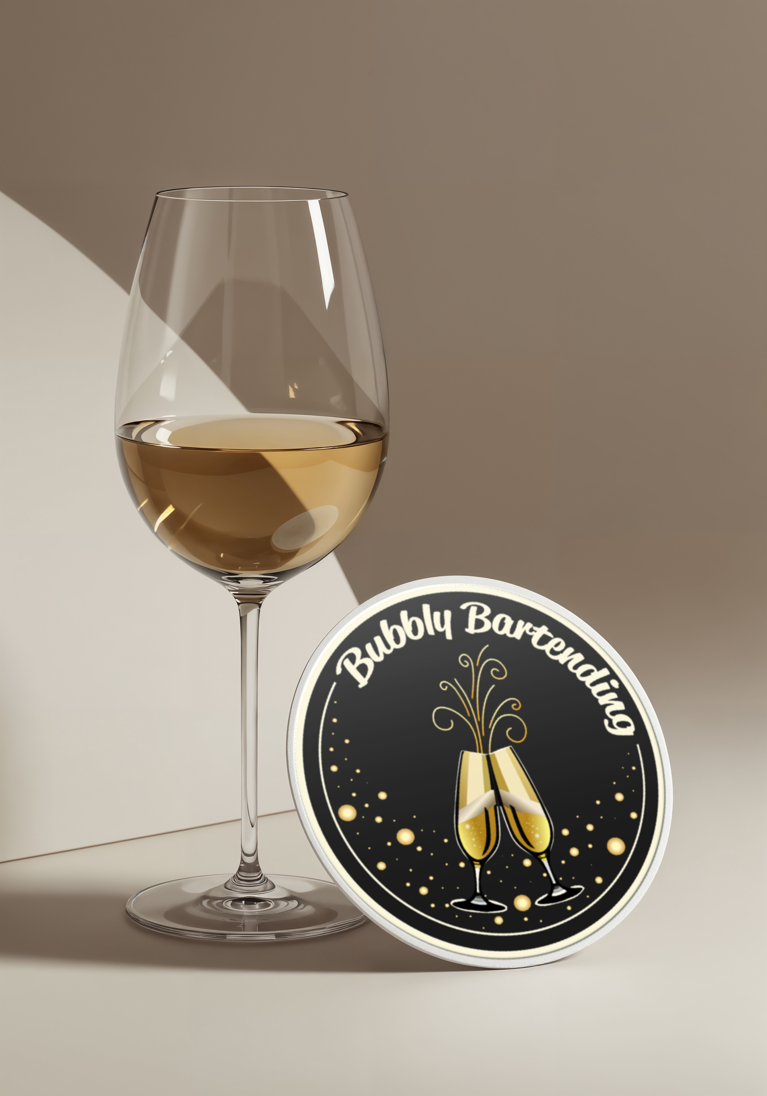
The redesigned logo is currently used across:
- Event signage
- Coasters
- Apparel
- Digital promotion
- Client materials
The brand has continued to grow successfully using this updated identity system.
Seeing a logo transition from concept sketch to real-world merchandise is one of the most rewarding aspects of brand design. This project reflects not only creative execution, but long-term brand partnership.