Preface
In 2022, I completed a full UX critique and redesign of the official NASA mobile app as part of a design assignment at Duquesne University. The project required analyzing the existing app, identifying usability issues, researching inspiration, sketching new solutions, and developing a complete redesign in Figma.
The objective was not to reinvent NASA’s identity, but to modernize its digital experience while preserving its authority and educational value.
Phase 1 - App Audit & Critical Evaluation
Before redesigning anything, I evaluated the existing NASA app across structure, hierarchy, consistency, and usability.
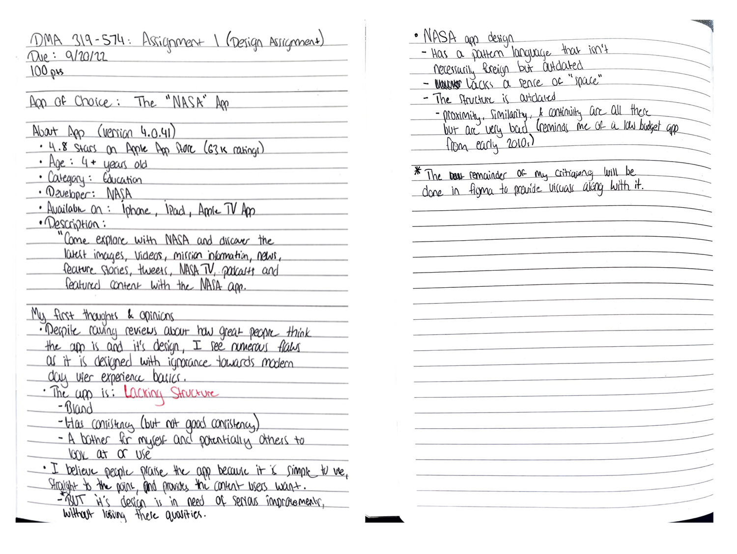
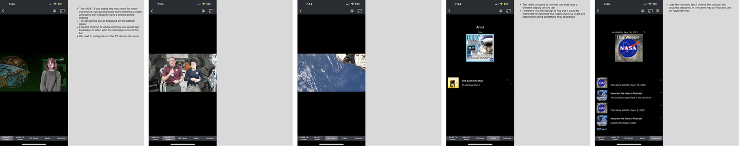
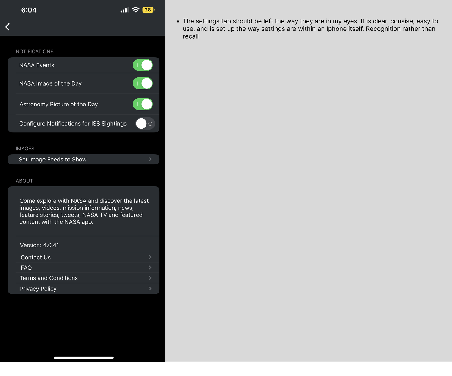
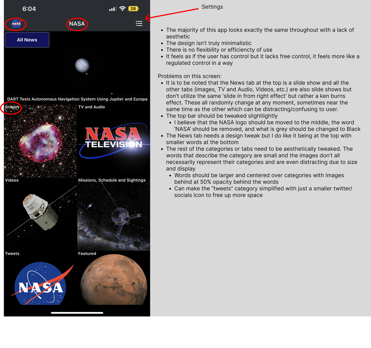
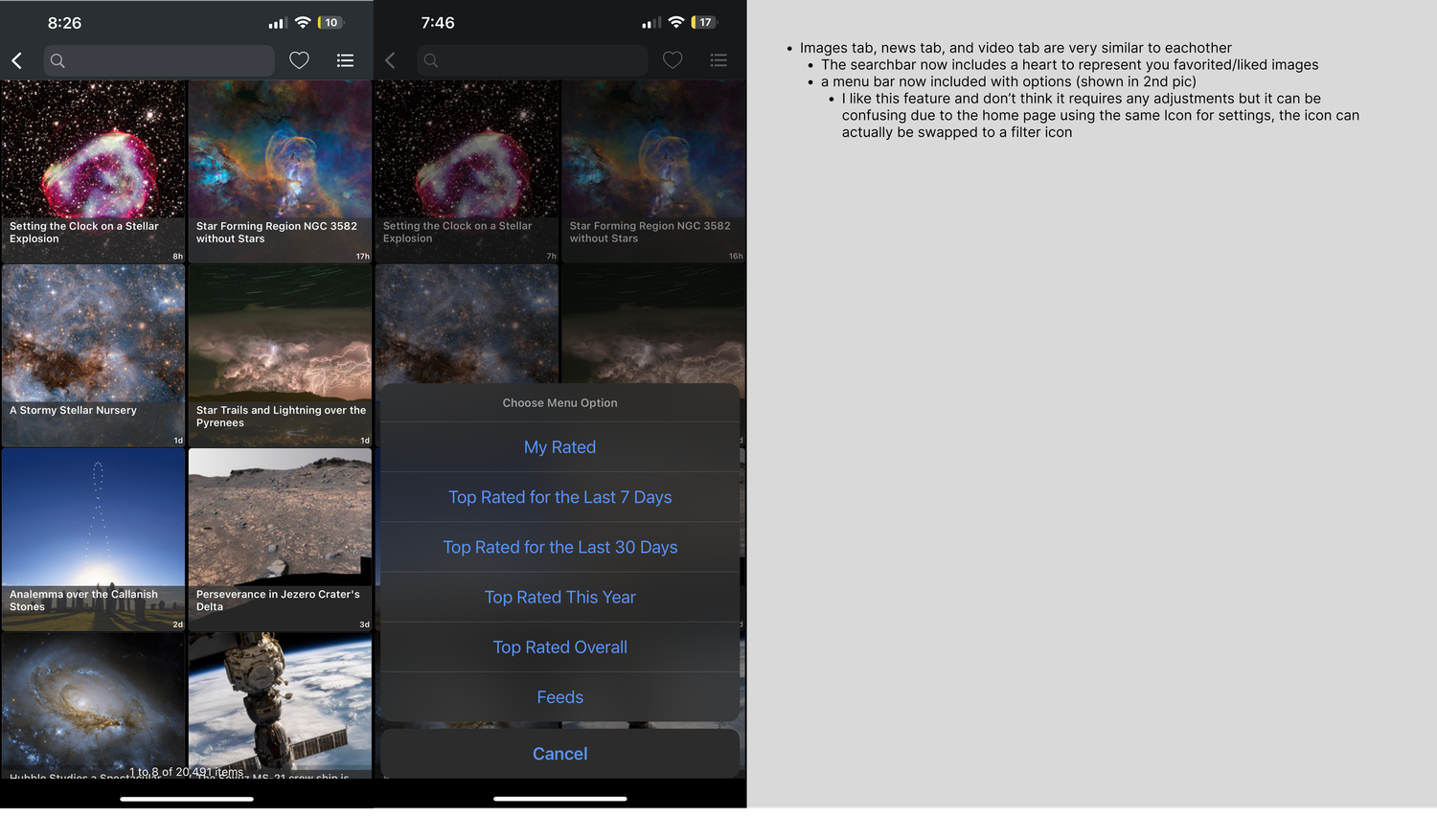
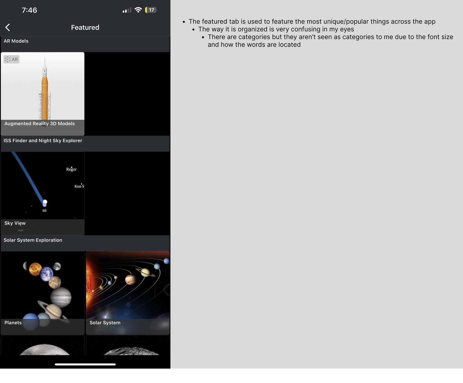
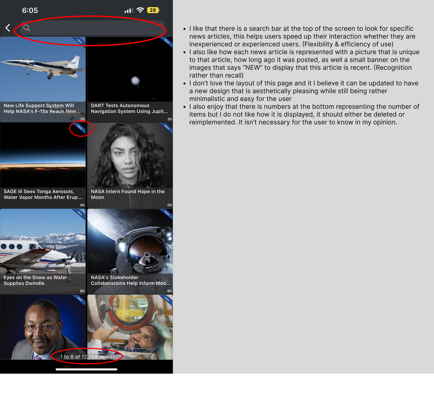
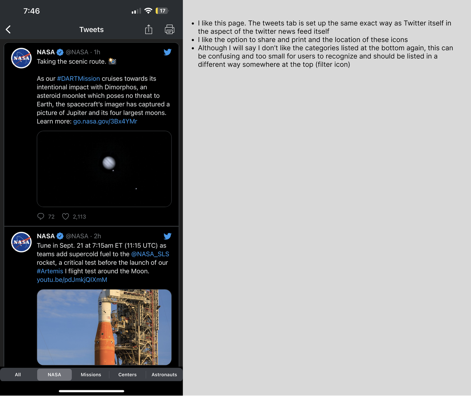
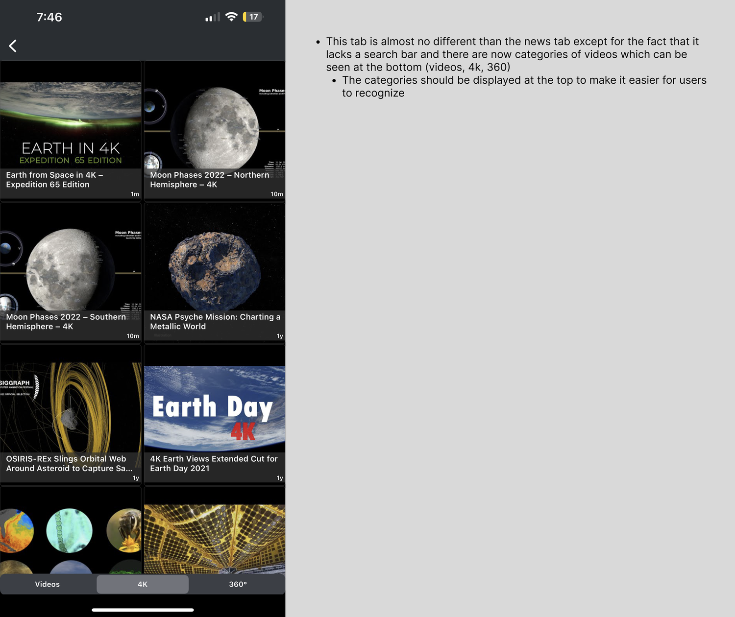
While the app delivered valuable content — images, missions, NASA TV, podcasts, and news — the interface felt visually dated and structurally inconsistent. Navigation patterns shifted between tabs. Some pages lacked search functionality while others included it. Category labels were small, unclear, or placed inconsistently. The slideshow behavior across tabs varied in animation style, creating unnecessary cognitive friction.
The app was functional.
But it didn’t feel cohesive.
It lacked what designers call pattern language — a consistent system of visual and interactive rules that users can quickly learn and trust.
My written notes documented specific friction points:
- Inconsistent top navigation
- Unclear category hierarchy
- Crowded content layouts
- Weak visual distinction between sections
- Overuse of small typography
- Redundant or confusing tab structures
The goal became clear: preserve the content strength while elevating structure, clarity, and modern aesthetics.
Phase 2 - Research & Inspiration
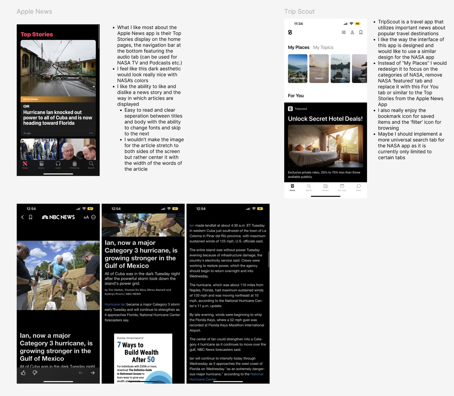
Rather than guessing, I studied successful content-heavy apps including Apple News and NBC News.
These apps demonstrated:
- Strong visual hierarchy
- Clear separation between headline and body
- Consistent placement of navigation elements
- Readable typography with breathing room
- Dark mode aesthetics that felt intentional, not default
I also evaluated layout systems that made category recognition effortless — ensuring users rely on recognition rather than recall, a core UX principle.
NASA is a brand rooted in exploration, scale, and wonder. The app needed to reflect that feeling without overwhelming users.
Phase 3: Sketching & Concept Development
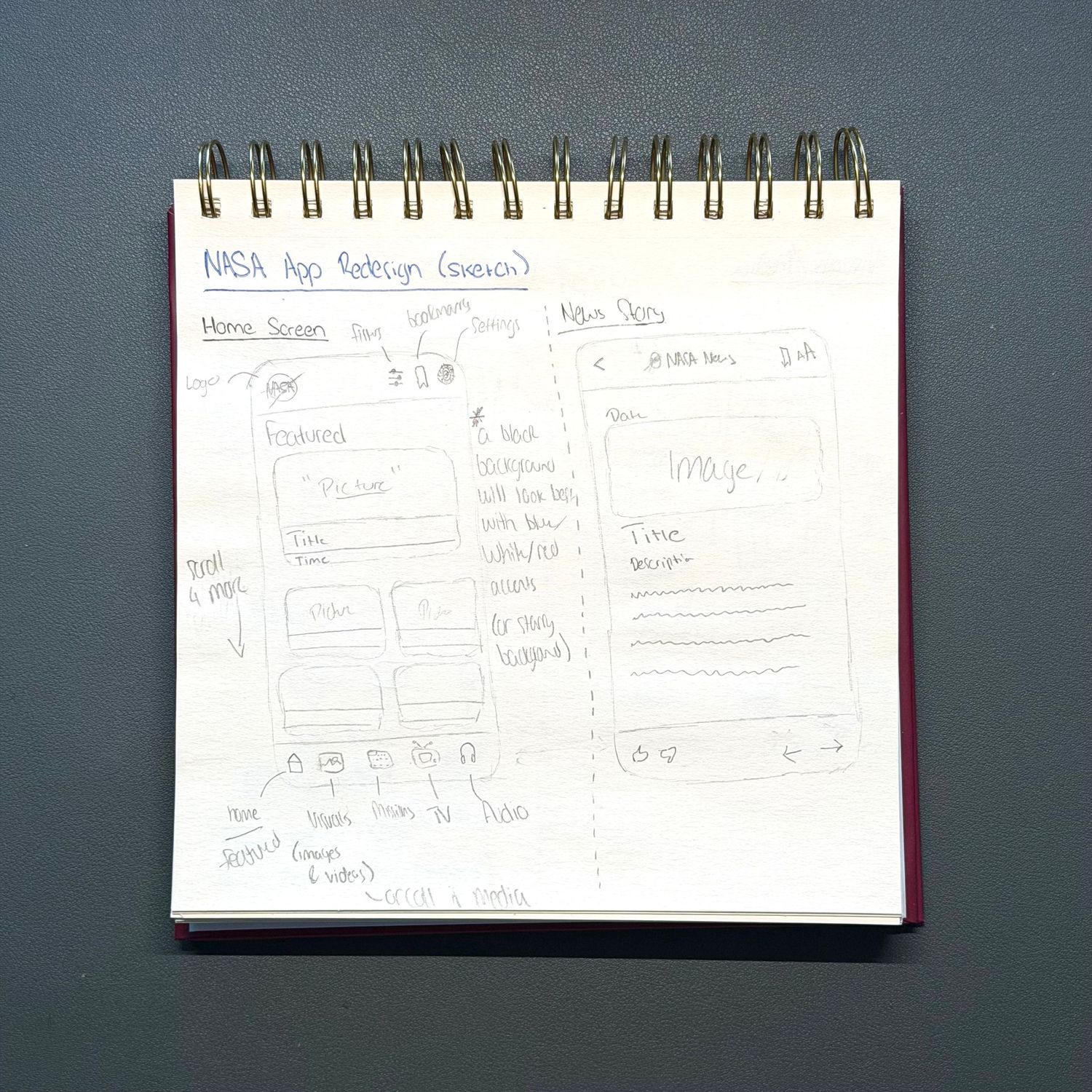
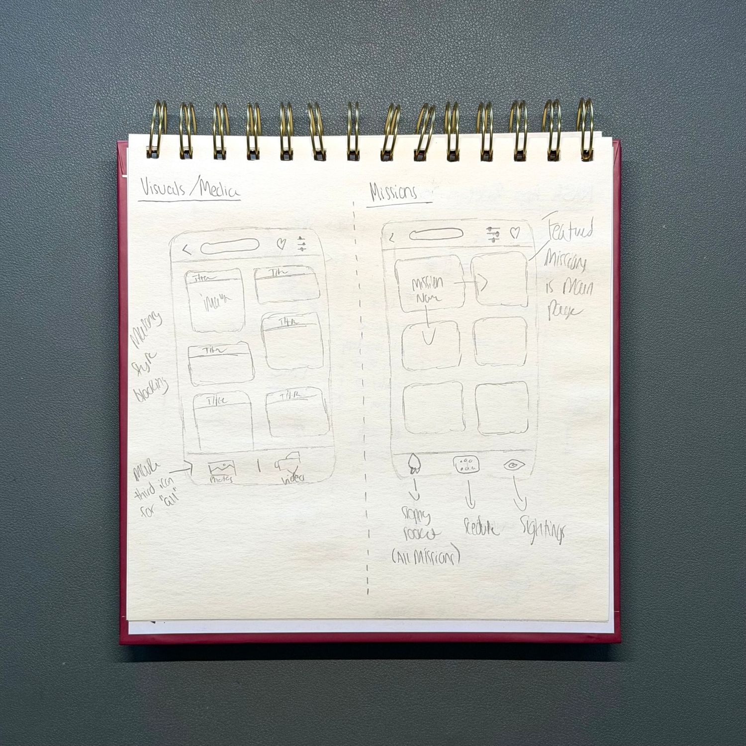
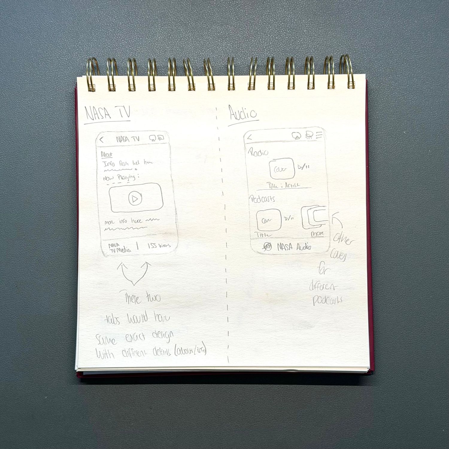
Initial sketches focused on restructuring navigation.
I reimagined:
- The Home screen hierarchy
- A unified bottom navigation system
- Clear category segmentation
- Larger, centered headings
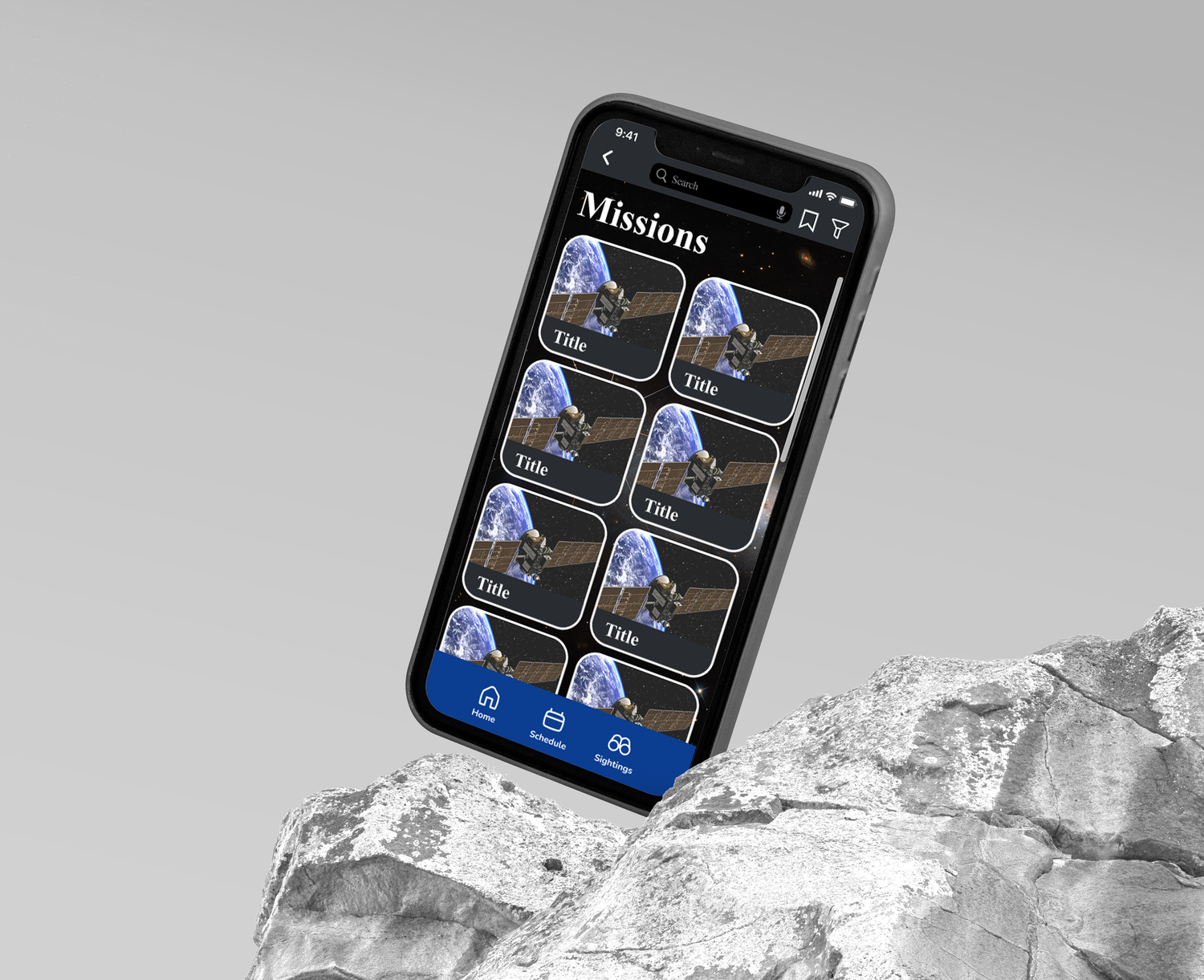
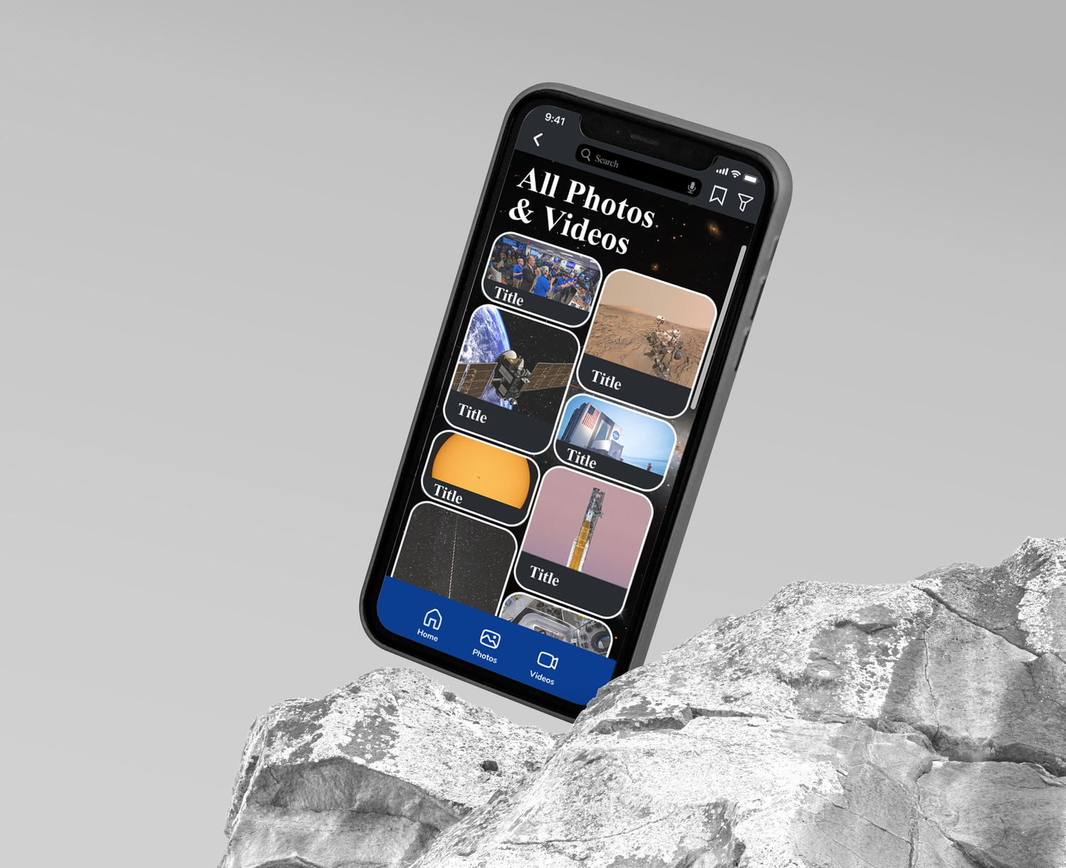
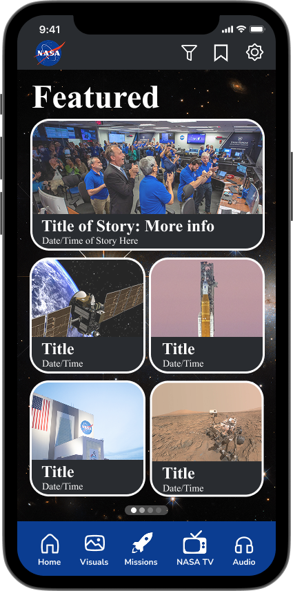
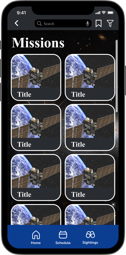
- Card-based layouts for missions, visuals, and featured content
- Improved search placement
- Stronger typographic presence
Sketching allowed rapid iteration without committing prematurely to pixel-perfect design.
It was about architecture before aesthetics.
The redesign emphasized:
- Consistency across tabs
- Modular card systems
- Stronger content containment
- Larger image-forward storytelling
- Simplified iconography
Phase 4: Figma Execution
After validating structure through sketches, I built the full interface system in Figma.
Key improvements included:
Unified Navigation
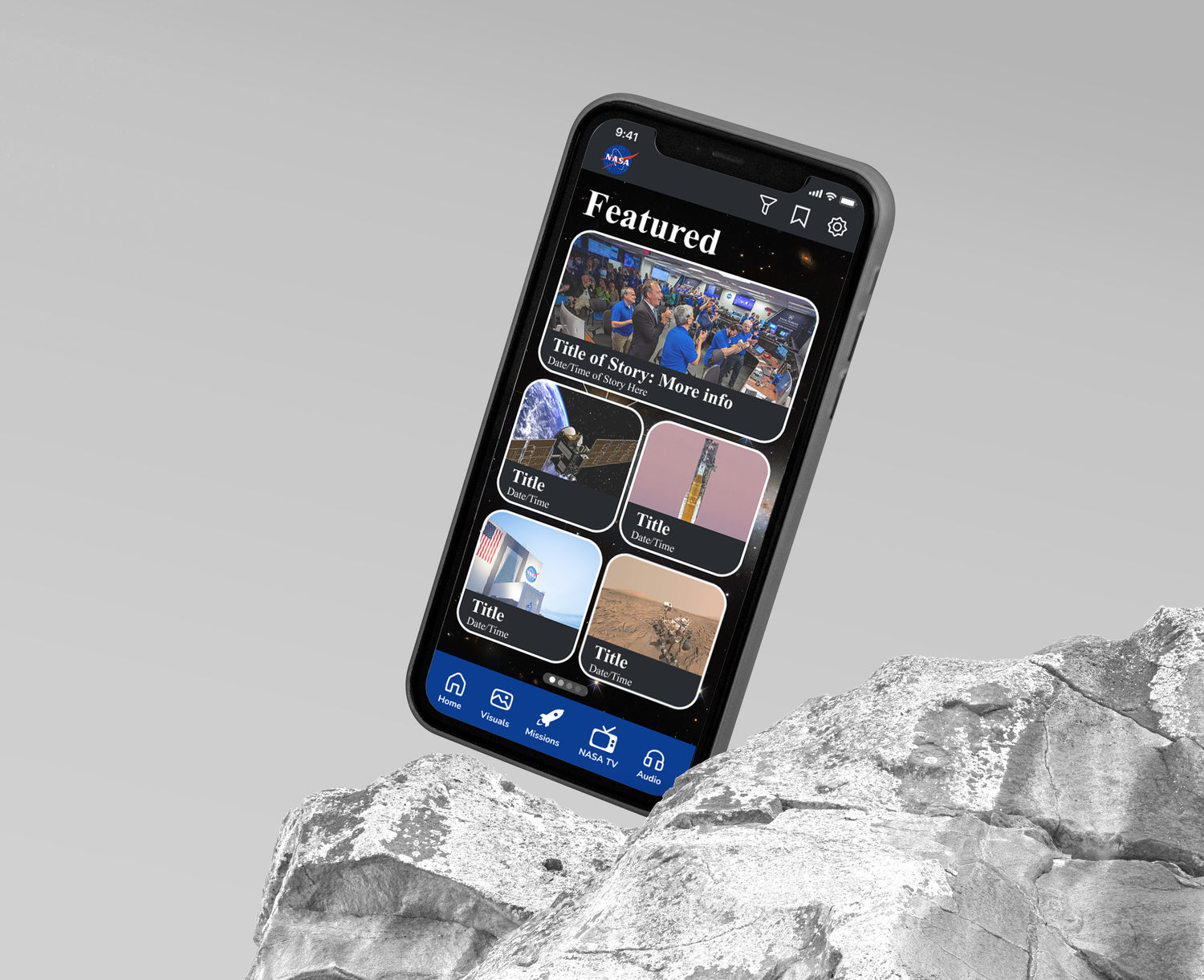
A consistent bottom navigation system across all major sections — Home, Visuals, Missions, NASA TV, and
Audio — ensuring predictable interaction patterns.
Elevated Visual Hierarchy
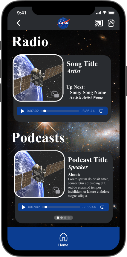
Large serif headlines paired with clean sans-serif body text to create contrast and authority. Headlines now feel like headlines.
Card-Based System
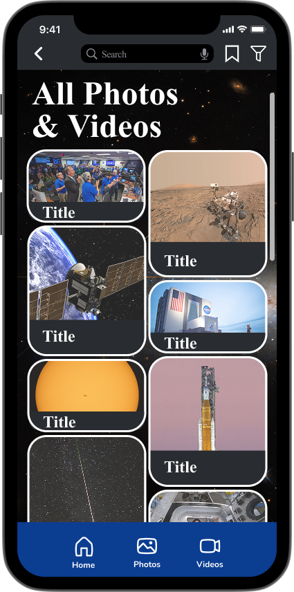
Rounded content cards with consistent padding and shadowing created rhythm and visual containment.
Improved Category Recognition
Categories moved to clearer placements at the top of screens. Labels were enlarged and centered for stronger scanning.
Search & Utility Icons
Search, filter, bookmark, and settings icons were standardized across screens to eliminate ambiguity.
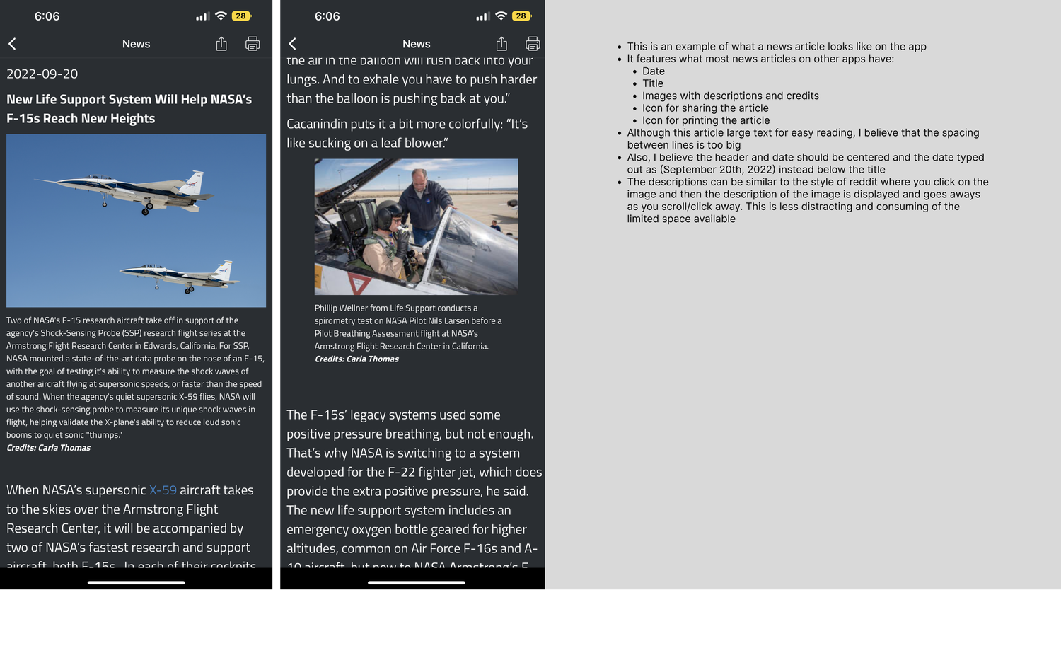
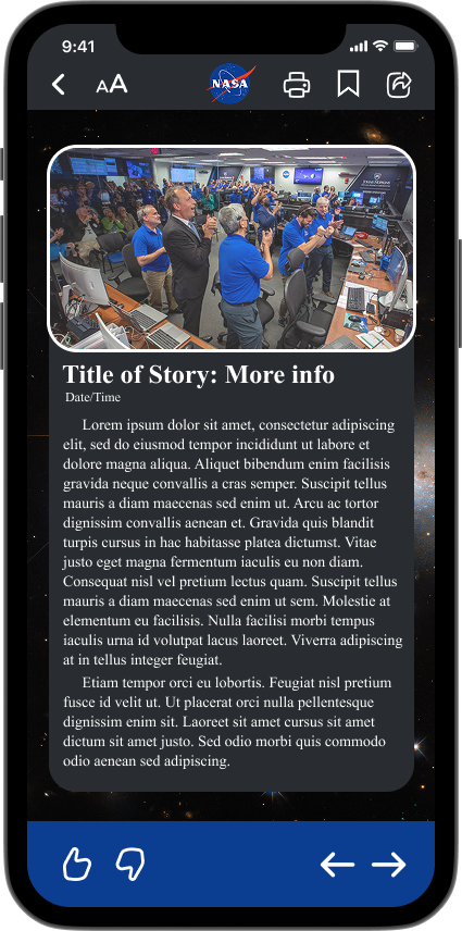
Refined News Article Layout
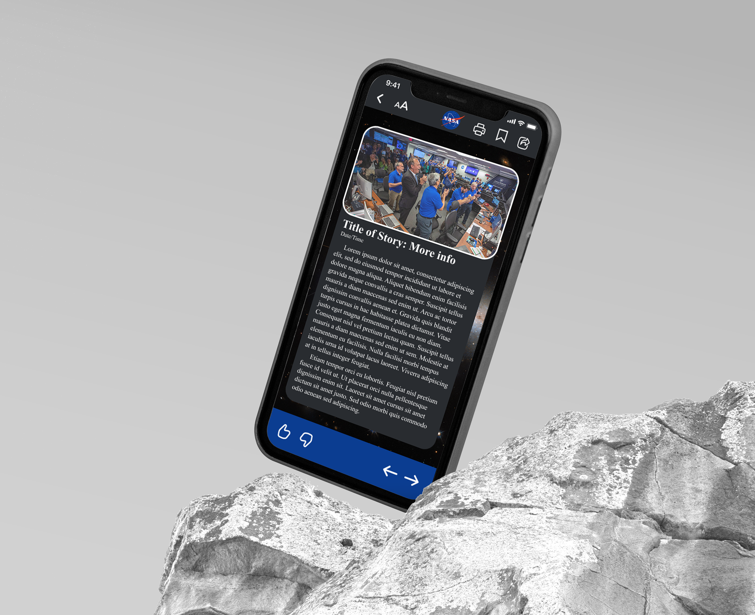
Article pages were redesigned with:
- Clear title hierarchy
- Improved spacing between paragraphs
- Centered imagery
- Better date formatting
- Consistent share/print controls
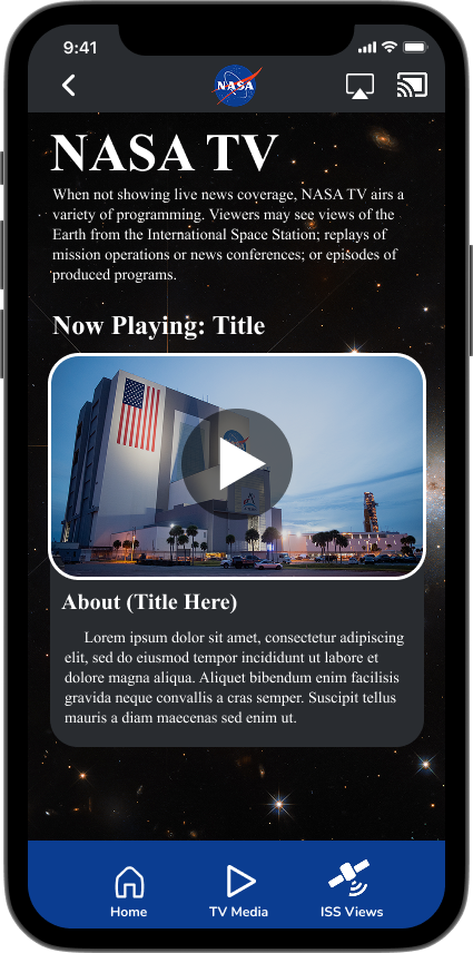
Modernized Media Experience
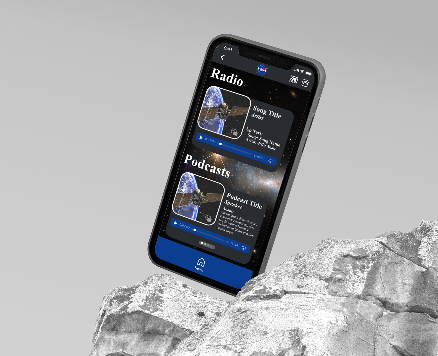
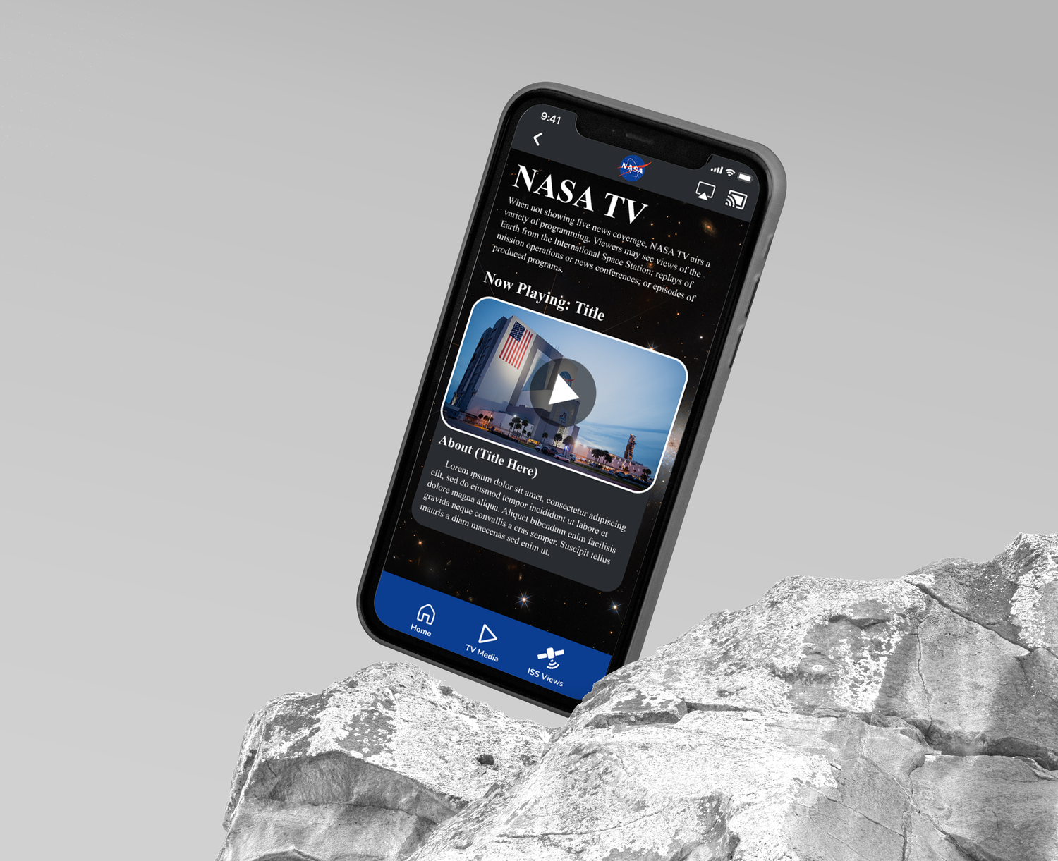
NASA TV and Audio sections were redesigned to feel immersive and media-forward, with clear “Now Playing” hierarchy and intuitive playback controls.
The aesthetic direction leaned into a subtle star-field background to evoke space while maintaining readability and restraint.
Phase 5: Final Mockups
To present the redesign professionally, I placed the final UI into realistic iPhone mockups.
This step elevated the project from wireframes to a believable product experience.
It demonstrated:
- Visual polish
- Real-world scale
- Hierarchy in context
- Cohesive brand presence
The mockups allowed the design to feel deployable rather than conceptual.