Preface
Vreen Machine Media is a creative media company built around the founder’s last name, “Vreen.” The business had an established name but lacked a defined visual identity. The goal was to create a logo system that felt distinctive, memorable, and aligned with the playful yet professional nature of the brand.
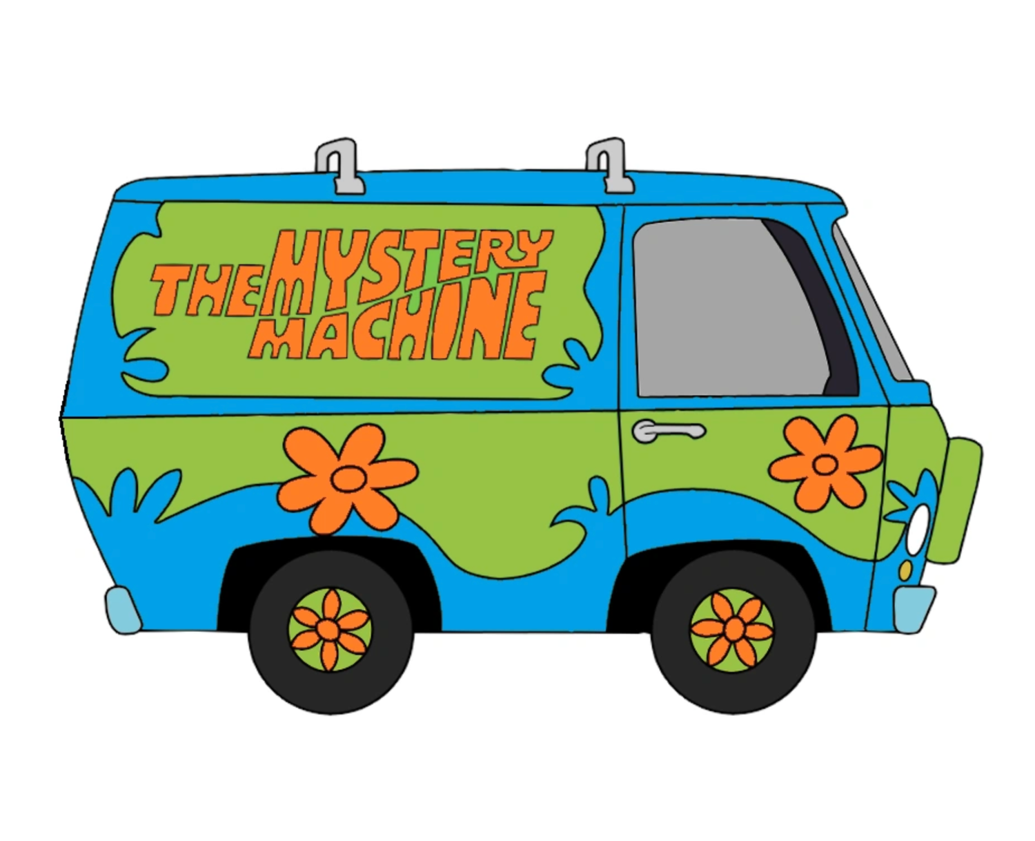
The inspiration came from the iconic Mystery Machine van from Scooby-Doo — specifically its bold curves, retro badge styling, and graphic wave elements.
The challenge was to reference that energy without infringing on it or reducing the brand to a gimmick.
Discovery & Concept Development
The early sketches focused on several directions:
- Industrial and machine-based iconography
- Gear and mechanical symbols
- Monogram-based “VM” concepts
- Circular badge structures
Through exploration, it became clear that literal machinery felt too rigid and predictable. The name “Machine” didn’t need gears to be understood.
Instead, the stronger direction leaned into retro badge design — capturing the flowing, wavy forms that made the Mystery Machine visually iconic.
The circular emblem structure allowed for containment, flexibility, and immediate brand recognition.
Design Strategy
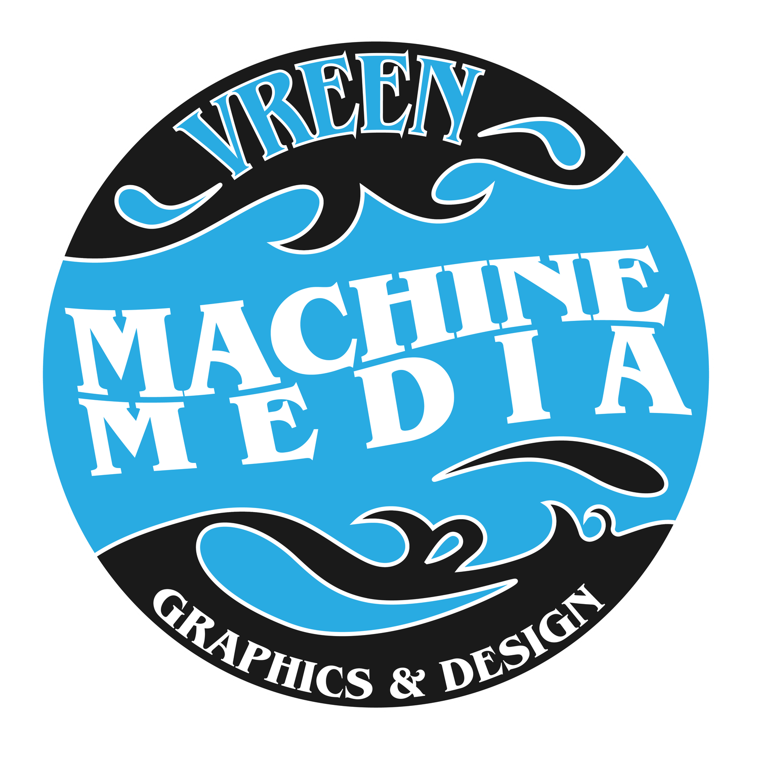
The final logo features:
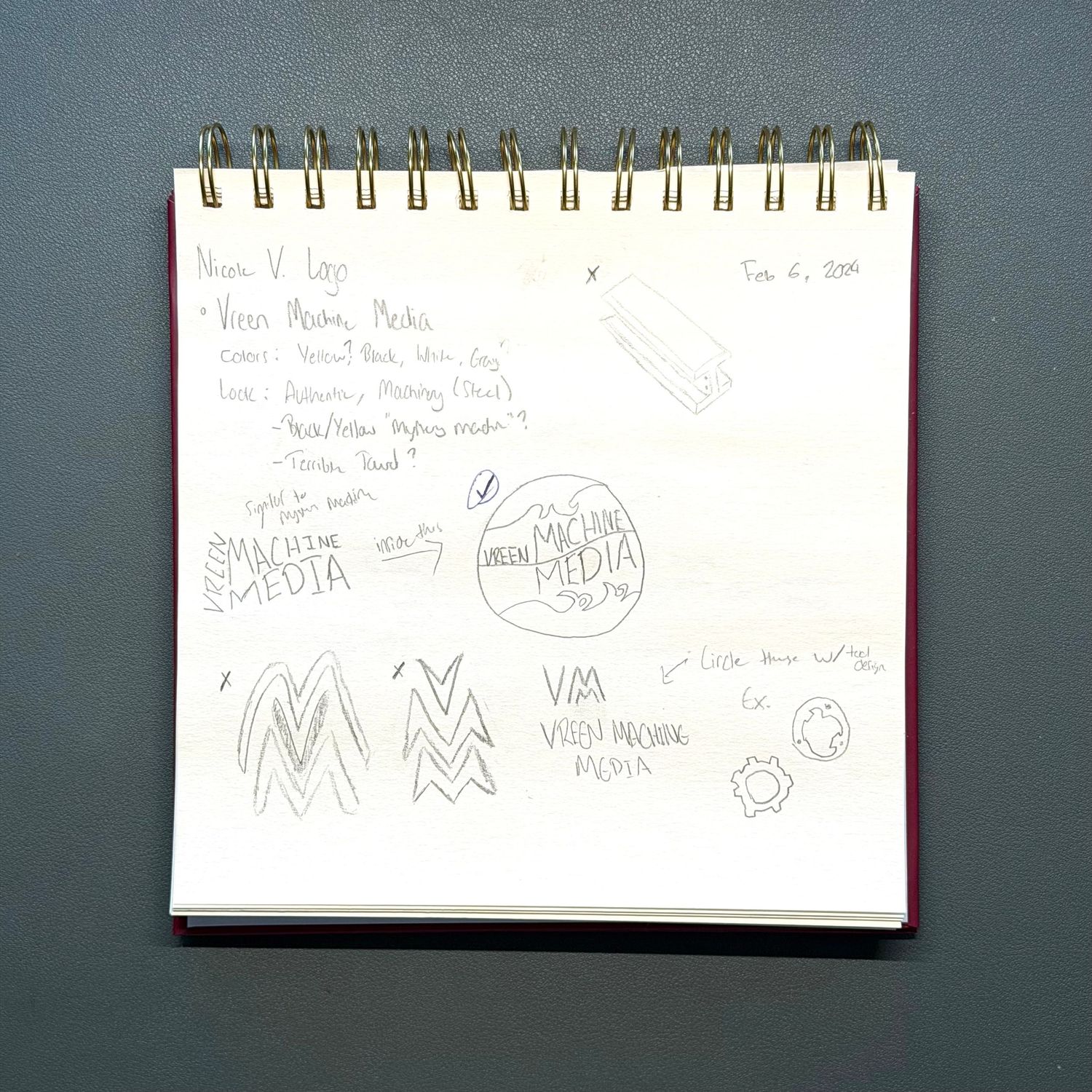
- A bold circular badge layout
- Flowing wave shapes inspired by vintage van graphics
- Strong serif typography for “Machine Media”
- A top arc highlighting “Vreen”
- A secondary line: “Graphics & Design”
The wave forms introduce motion and personality. They break up the rigid geometry of the circle and give the design energy.
The blue and black color palette nods subtly to the Mystery Machine aesthetic while remaining distinct and professional.
This balance was critical.
Nostalgia works only if it’s controlled. Too much, and it becomes costume. Too little, and the reference disappears.
Typography & Structure
Typography carries the weight of this design.
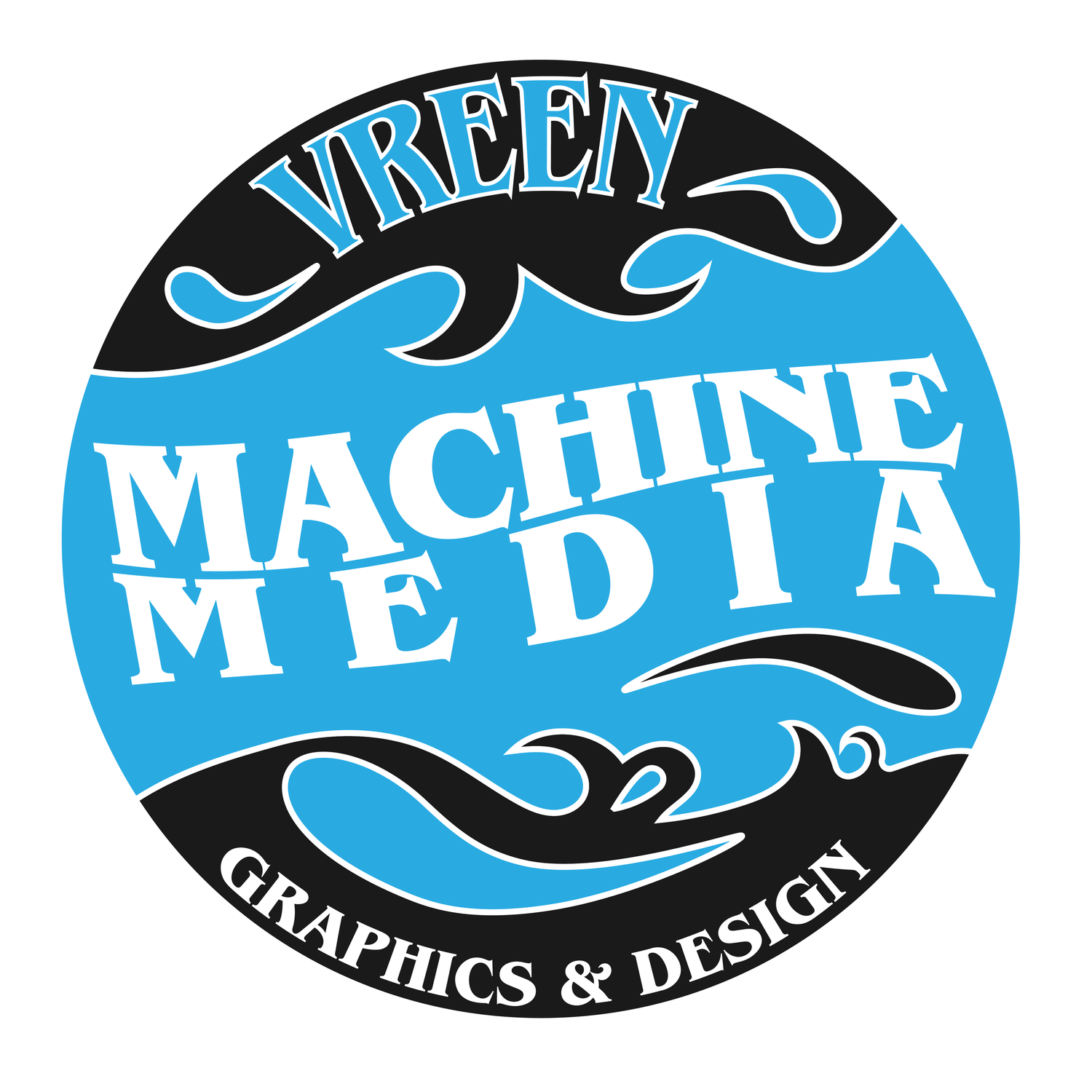
“Machine Media” is set in a bold serif to provide stability and authority. The slight arch and angled baseline add movement while maintaining legibility.
“Vreen” curves across the top arc, anchoring the founder’s name prominently without overpowering the central text.
The badge format ensures:
- Strong social media icon presence
- Clean merchandise application
- Easy scaling across digital and print
- Cohesive brand containment
Frome Sketch to Vector
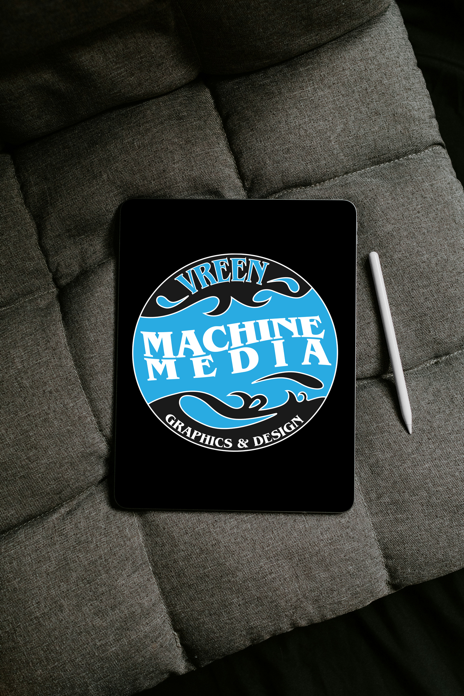
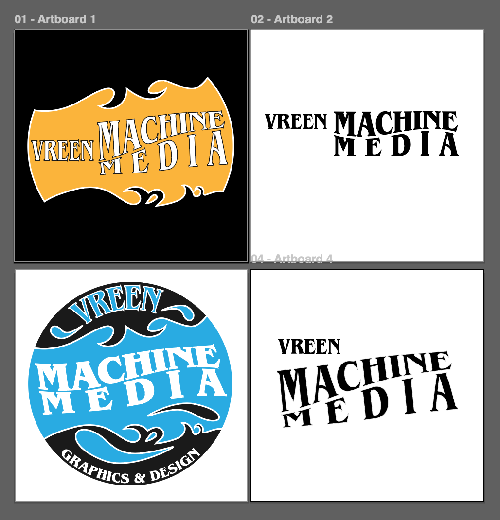
The project began with hand-drawn ideation, exploring mechanical symbols and badge compositions. These were refined digitally on iPad before being rebuilt as precise vector artwork.
That transition matters.
It shows iterative thinking, not just execution.
The final vector files were built for scalability, ensuring clarity whether displayed on:
- Social media avatars
- Website headers
- Merchandise
- Print collateral